We live in a special time. However much external circumstances might try to resist, man, it seems, is more intent than ever before on total unification, consolidation, and the merging of forces. Globality, collaboration, and decentralization are not synonyms of loss of authenticity nor even grounds to argue about appropriation. They are, on the contrary, predictable tendencies in the development of society: experiments involving a quest for harmony and equilibrium, and a looking for points of contact and mutual reinforcement.
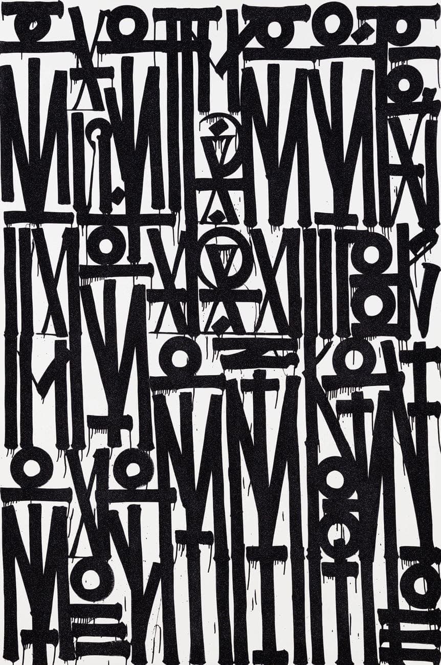
If we fantasize about individual manifestations of unification, what might the universal writing of the future look like? By absorbing signs, symbols, rhythms, and the geometries of different cultures, what messages might it be able to convey? Would it retain the finesse and aesthetic and historical value possessed by calligraphy, which is encoded in the way we currently perceive writing? In short, what would we end up with? Works by the artist Retna give us a glimpse.
Retna was born on 24 March 1979 in Los Angeles. His real name is Marquis Lewis, but to keep the tone right, it’s best if we forego the almost regal aura of his birthname in favour of his street name. He has had many different street names at different times. He chose the last of them, Retna, ‘because, damn, that's dope’. The source of this ‘dope’ is the text of a track called ‘Heaters’ by the Wu Tang Clan: ‘Kinetic globes light when it shine, burns your retina.’


Retna has Afro-American, Salvadorian, Spanish, and Cherokee roots. He grew up facing hostility from each of these ethnic groups – always feeling there was no environment in which he could be understood and accepted. This influenced his pursuit of unifying techniques in the production of art and his quest for resemblances instead of differences. He absorbed history and visual codes from books on native Americans and studied the runic alphabet, Ancient Egyptian hieroglyphs, and frescoes with symbolic depictions covering temple walls.
As a child, Retna often observed the florid paintings that covered motorways in the US. He liked these saturated spots of colour that seized the attention. He realized he wanted to do something similar but had no idea of the problems and potential arrests that lay behind this harmless but illegal activity. His first experiments with aerosol paint were painted-over advertising posters and long old-school ‘pieces’. At the end of the 1980s Retna joined one of the most influential graffiti gangs in the City of Angels – AWR/ MSK/ The Seventh Letter Crew. Approximately in 1997 Retna realized he wanted to do something bigger than graffiti and switched from street to figurative art, which stood a better chance of being approved for an exhibition in a gallery. Ironically, of course, this kind of domesticated street art created in a studio has shaped the current situation whereby galleries are only too keen to show street art in their white-cube spaces.


In the 1990s Los Angeles was taken over by street gangs drawn from the legal and illegal waves of migrants in the 1960s. 1988 was the ‘year of the gangs’. Then came 1992, the bloodiest year. Many Afro-American gangs used fonts taken from old English slang (Black Letter) as their distinguishing marks.

Gangs used this elegant font with its medieval aura to create the titles of gangsta rap albums and paint house façades as a way of claiming territory as their own. Having spent so much time hanging out on the streets, Retna remembered this old English aesthetic and tried superimposing it on the graffiti techniques he had picked up. Fusing the writings of ancient civilizations with a modern street style, he set about creating a language that would be capable of representing many different cultures simultaneously. Even before the Russian artist Pokras Lampas began promoting his concept of calligraphofuturism, Retna was realizing the principles of calligraffiti in practice in the 2000s and 2010s.


For fairness’ sake, it should be said that Retna was not the forefather of this movement. He was merely building in his unique manner on the ideas of Neils Meulman, the father of calligraffiti.

Retna’s style stands out thanks to his use of a flat brush that gives more control and the ability to create precise, almost prickly forms. Given that the characters are written in a strictly geometrical order, we may say that Retna literally draws what he has to say. By using the brush as well as that popular graffiti instrument the aerosol can, he introduces an element of traditional calligraphy. Particularly noticeable is the influence of Arabic calligraphy, whose strict rules and precision derive from its historical use to copy the Koran.
In many works by Retna we find a recurrent element that resembles a stylized – but in some cases mirror-reflected – image of the ancient Egyptian Wadjet, the eye of the god Horus. This sign, which migrates from work to work, looks as if it could have been created by re-assembling and cleaning the initial image. Retna takes apart the falcon’s ‘eye’, leaving only two parallel lines holding a circle between them. Which eye is Retna alluding to – left or right? And does the eye refer to the Sun or the Moon? A similar sense of mystery attaches to the content of the messages wrapped in this special language.


Retna says that for him the process of writing a message in pictures is like meditation. His canvases retain the best and the worst of his days, his worldly and everyday wisdom, his triumphs and weaknesses, his hopes and fears. Sometimes this looks like the automatic writing of thoughts whose meaning is ultimately incomprehensible to even their author himself. At risk of immersing himself too deeply in New Age philosophy and driving his audience away, Retna encodes his messages, meticulously transforming both the meanings of words and their constituent parts – letters – into unrecognizable structures. The exception is when Retna works with a statement that is already well-known.


One such case was a joint project with the Kennedy Centre in 2017 for which Retna created a large work that refers to President John F. Kennedy’s well-known saying, 'Art is the great democrat, calling forth creative genius from every sector of society, disregarding race or religion or wealth or colour.’ Retna turned ten panels into totemic monuments that manifest words using the colours of the American flag and symbols reflecting cultural diversity in the US.


The hypnotic effect you feel when you spend any length of time contemplating Retna’s works seems to arise automatically during the process of creation. In interviews Retna has often said he always works listening to music through headphones. Settling on a single composition, he tries to feel its rhythm, settles into a state of flow, and then translates this flow onto the canvas through his brush. This ability stood him in good stead when he designed the set for a production of Aida at Washington National Opera and San Francisco Opera. The plot of this opera takes place in Ancient Egypt, so Francesco Zambello, its principal director, had the idea of inviting Retna to develop a modern version of this story from the deep past.


Fortunately, deep immersion in the captivating dance of written characters does not always require special effects and theatre equipment. Sometimes it’s enough just to look at the letters for a long time: at a certain point the linguistic digits are transformed into ordered mystic abstractions. This effect is paradoxical: the overall mass of the painting may remain unrecognizable even when the picture has been put together and based on real styles and symbols. Like Cy Twombly, Retna works at the border between graffiti, calligraphy, and abstract art. He creates his own unique lexicon but does not use it to convey a message that is conveniently readable. He turns interaction with the picture into a spiritual experience for both the viewer and himself, the artist.
Each work of art is a mirror. This mirror reflects the personality of the viewer and the creator and in a veiled, poetic form illuminates entire worlds of images, making it possible for us to feel our own authenticity in the act of self-recognition, to feel at one with others – with those who see something different in this mirror.


When you stop opposite works by Retna or bump into them in a gallery or on the walls of Los Angeles,